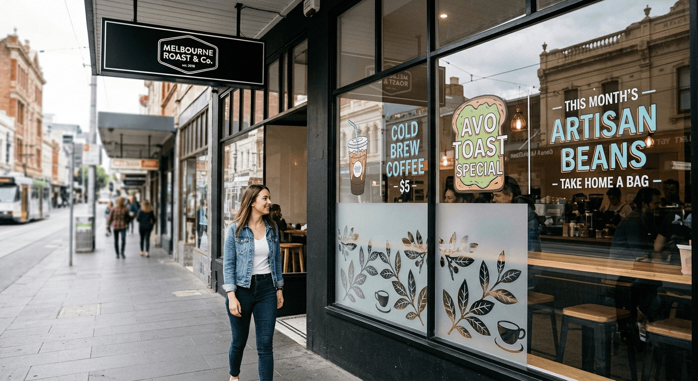
Foot traffic outside your shop is fine. Actually, it might be busier than ever. But almost nobody stops. They glance, keep walking, and spend their money two doors down instead.
That’s not bad luck. That’s a signage problem.
Most shops lose walk in customers because of seven fixable signage mistakes. Tiny text, poor colour contrast, cluttered window sigange, wrong placement, no clear call to action, inconsistent branding, and ignoring sightlines from the direction people actually approach from.
Fix even three of these and you’ll see real foot traffic improve within weeks. None of this needs a full shopfront rebuild. It just needs a proper audit.
Table of Contents
ToggleKey Takeaways
- Small, hard-to-read fonts are the most common reason pedestrians walk straight past a shop.
- Cluttered window signage can actually reduce visibility more than having no signage at all.
- Letter height should roughly match one inch of height for every ten feet of viewing distance.
- Colour contrast matters more than font style when someone’s trying to read a sign at a glance.
Why Do Customers Walk Past Shops That Are Easy to See?
Because being visible and being readable are two different things.
Your shop can be fully visible, with nothing blocking it, decent lighting, and good foot traffic outside, and still fail completely because nobody can read what it says in the two seconds they’re walking past.
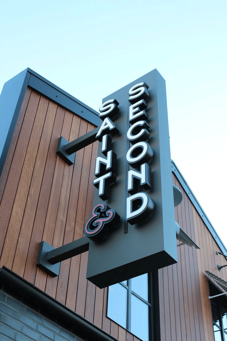
Sign legibility research backs this up. There is a direct link between letter height and how far away a sign can be read, and the general rule is that one inch of letter height gives you about ten feet of readability.
So if your fascia sign has three-inch letters and people are reading it from across a two-lane street, they’re not actually reading it. They’re guessing.
The 7 Retail Signage Mistakes That Are Costing You Sales
None of these mistakes are complicated. But each one quietly chips away at your foot traffic.
Mistake 1: Font Size That Doesn’t Match the Viewing Distance
This is the big one.
Shop owners pick a font because it looks good up close, on a laptop screen, and in a design mockup.
On a busy road where cars pass at higher speed, signs often need letters as tall as fifteen inches just to be readable in time. A shop using four inch letters simply isn’t giving drivers enough time to read the name before they’ve passed.
Pedestrians need less distance than drivers, sure, but the same idea applies. Guess the size and you’ll usually guess wrong.
Mistake 2: Colour Contrast That’s Too Low
Grey on white looks sleek in a design mock up. It’s almost unreadable from the street.
Strong contrast between your text and background is what makes a sign readable at a glance, in bright sun, in shade, or under artificial light at night.
Combinations like white on black, black on white, or dark blue on white work well in almost any lighting, while soft combinations like grey on white or blue on black tend to disappear at a distance.
If you picked a subtle, on brand colour palette for your sign, there’s a good chance it’s quietly working against you.
Mistake 3: Windows Cluttered With Too Many Signs
Every poster, every sale sticker, every printed sheet taped up over the years adds up.
One or two promotional pieces work fine. Ten of them turn your window into noise, and people’s brains naturally skip past noise.
I’ve seen shopfronts with genuinely great products completely hidden behind six different posters all fighting for the same small patch of glass.
Mistake 4: Signage Placed in the Wrong Spot
Sightlines matter more than most owners realise.
A sign built for someone walking up from the left is wasted on someone approaching from the right.
Think about the real customer journey. Where do people come from? Are they walking or driving? What’s their eye line?
Place your signage based on the answers, not on what looks nice from inside the shop.
Mistake 5: No Clear Reason to Stop
A sign that only shows your business name isn’t doing enough work. “Est. 2015” doesn’t tell anyone anything useful.
Good signage gives people a reason to actually stop, even something simple like “Open now” or “Fresh coffee daily” works far better than a name on its own.
Mistake 6: Branding That Doesn’t Match Across Signs
Your fascia sign says one thing, your window graphics say another, and your A frame out front looks like it belongs to a completely different business.
Brand consistency isn’t just about looking polished. It’s about recognition.
People need to see the same colours, fonts, and tone everywhere before your brand actually sticks in their memory.
Mistake 7: Forgetting Signage Once Customers Are Inside
This one gets missed all the time.
You’ve nailed the outside, but once someone walks in, there’s no wayfinding signage and no in store signage pointing them toward what they actually came for.
You worked hard to get them through the door. Don’t lose them to confusion once they’re inside.
Where Custom Signage Actually Solve Half These Problems
A well-designed custom retail signage solves placement, contrast, and clutter all at once, because it’s built for the exact needs of your business, not added as an afterthought.
Window n’ Wall Graphics designs around sightlines and viewing distance from the very start, not after the mistakes have already been made.
More Signs Don’t Mean More Visibility
Most owners assume adding more signage fixes a visibility problem. Usually, it makes things worse.
Every extra sign competes with the last one for the same two second glance. One clear, high contrast message beats five competing ones every single time.
If your shopfront already has a fascia sign, window graphics, an A frame, and a banner all saying different things, you don’t have a visibility problem. You have a hierarchy problem.
Shopfront Signage Types Compared
| Signage Type | Best For | Common Mistake |
| Fascia signs | Brand identity and street level recognition | Letters too small for the viewing distance |
| Window graphics | Promotions, privacy, close range messaging | Too many messages crowding one window |
| A frame signs | Catching pedestrians at ground level | Placed outside the natural walking path |
| Illuminated signage | Night time and low light visibility | Low contrast colours that wash out under light |
| In store signage | Guiding customers once they’re inside | Skipped entirely after exterior signage is done |
Questions People Also Ask
1. How often should I update my shop front signage?
At least once a year, and sooner if your branding, hours, or offers have changed.
2. Does window tint affect how visible window graphics are?
Yes, a little. Darker tints need higher contrast graphics to stay readable from outside.
3. What’s the biggest signage mistake new businesses make?
Designing the sign on a screen and never testing it from the actual street distance.
4. Does the direction my shop faces affect signage visibility?
Yes. North or west facing shopfronts deal with more glare, so you’ll need stronger contrast to stay readable.
5. How much does shop front signage typically cost in Melbourne?
It varies widely based on size and material, but window graphics are usually the most affordable starting point.
Fix This Before You Lose Another Customer
Walk outside your own shop. Stand across the road. Can you actually read your own sign in two seconds? If not, that’s your first mistake found already.
From there, clear out cluttered signage down to one simple message, check your contrast, and make sure every sign type, fascia, window graphic, and A-frame all say the same thing in the same voice.
If the fix needs new glass branding or custom graphics, Window n’ Wall Graphics can help you work out what actually suits your shopfront’s sightlines:
Small changes here can move your foot traffic fast.