Poor wayfinding signage is a silent revenue killer. Good signage design means placing clear directional signs at every decision point, using simple information hierarchy, readable typography, and strong colour contrast. Do this right and your space guides people naturally. Get it wrong and your visitors give up before they even get started.
We built Window N Wall Graphics’ wayfinding signage solutions because we kept seeing beautiful spaces fail their visitors. Great fitouts. Zero logical sign flow. Confused customers. Frustrated staff.
I’m breaking down the truth about decision points, the math behind information hierarchy, and why the “just add more signs” advice is actually a trap.
Table of Contents
ToggleKey Takeaways
- Place directional signage at every decision point, not just at the entrance.
- Limit each sign to one clear message so visitors can process it fast.
- Tactile signage, Braille, and strong colour contrast are required under wayfinding signage guidelines across Australia.
- A consistent visual system across all wayfinding signs beats having more signs every single time.
Why Do Visitors Get Confused in the First Place?
It’s not that people can’t navigate. It’s that most spaces are built for the people who work in them, not the people who visit them.
More than half of venue visitors experience navigation problems. That’s not a fringe issue. That’s the majority of your foot traffic silently struggling. And it gets worse. Over a third of visitors say clear wayfinding signs directly affect whether they feel safe in your space. Not just informed. Safe.
I’ve seen retail stores spend big on interior design and then lose customers at the second corridor because there was no directional signage past the entry point.
Is Your Signage a System or Just a Bunch of Signs?
This is the question most business owners never ask. And it matters more than anything else.
A proper wayfinding system includes directional signs, floor directories, identification signs, and orientation maps. They all work together. They support the full visitor journey from entry to destination and back again.
Window N Wall Graphics works with cafés, retailers, and commercial spaces across Australia. The spaces that brief us on visitor flow first, not aesthetics first, always end up with wayfinding that actually works. It’s that simple.
What Does Good Wayfinding Signage Design Actually Look Like?
-
Start at Decision Points, Not Walls
Signs belong at decision points. Intersections. Lift lobbies. Stairwells. Any place where someone has to choose a direction.
Walk your space like a stranger would. Time how long it takes before you feel unsure. That moment of uncertainty is exactly where your next directional sign needs to go.
-
Typography and Colour Do Real Work
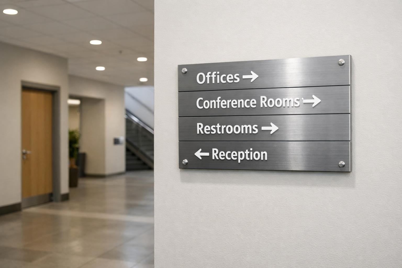
The best wayfinding signs use simple sans-serif fonts, clear arrows, and colour coded zones. This is not about style. It’s about function. Strong colour contrast helps everyone read your signs fast, including people with low vision. Accessible wayfinding signage design is not a bonus feature. It’s a baseline requirement.
-
Sign Height Is a Specification
Mount signs at 48 to 60 inches from the floor. That’s the standard eye level for both standing adults and wheelchair users. Too high and seated visitors are left out. Too low and crowds block it. I’ve seen this mistake in brand new fitouts that cost six figures. It’s completely avoidable.
-
Tactile Signage and Braille Are Not Optional
Tactile lettering and Braille signs make key information accessible to visitors with visual impairments. This is both a legal requirement under Australian standards and simply the right thing to do. Any solid set of signage guidelines will tell you the same.
The Wayfinding Design Checklist
Use this before you order a single sign:
- Map your visitor journey from entry to every destination.
- Mark every decision point where someone must choose a direction.
- Set a clear destination hierarchy: primary spots like exits and toilets, then secondary zones, then detail level information.
- Pick one sans-serif typeface and stick to it.
- Lock in your colour system with one main wayfinding colour, one accent, and strong contrast throughout.
- Test with real first time visitors, not your own team.
- Add tactile and Braille signs to all permanent key locations.
- Use the same name for every destination across signs, maps, and printed materials.
- Check for sight line blocks like pillars, plants, and displays that cover your signs.
- Do a review 90 days after installation and adjust what is not working.
More Signs Makes Things Worse
Everyone says if people are confused, add more signs. That advice is wrong.
I’ve seen spaces so covered in signs that visitors shut down before they’ve taken ten steps. Too much information creates decision fatigue. When every wall is competing for attention, people stop reading entirely.
The fix is not more signs. It’s smarter placement, simpler messages, and fewer words per sign. One clear and consistent directional signage design will always beat a wall full of disconnected wayfinding signs.
Static vs Digital Wayfinding: Which One Do You Actually Need?
| Feature | Static Wayfinding Signage | Digital Directional Signage |
| Upfront Cost | Lower | Higher |
| Ongoing Cost | Minimal | Needs maintenance and updates |
| Content Flexibility | Fixed | Can update in real time |
| Accessibility | Tactile and Braille options available | Screen reader and multilingual capable |
| Best For | Retail, cafés, small offices | Hospitals, airports, large venues |
| Wayfinding Signage Australia | Best fit for most small and mid-size businesses | Growing in larger commercial spaces |
| Visitor Trust | Strong, permanent, premium feel | Modern and high-tech look |
For most cafés, retail stores, and mid-size businesses in Australia, well-designed static wayfinding signage still gives the best return.
People Also Ask
1. Can wayfinding signs work for a small single-floor café?
Yes. Even a small space has decision points. A counter, a hallway, a bathroom door. Two or three well placed signs can completely change how customers move through your space.
2. How often should wayfinding signage be updated?
Review your signs any time your layout changes, after a refurbishment, or at a minimum every two years. Outdated signs cause just as much confusion as no signs at all.
3. What materials work best for wayfinding signs in Australian conditions?
For indoor use, aluminium composite, acrylic, and PVC are all solid choices. For outdoor or high traffic areas, go with UV resistant materials and anti-glare finishes.
4. How do I know if my current signage is already failing?
Watch your visitors. If people stop, look around, backtrack, or ask staff for directions regularly, your signage is not doing its job.
5. Does better wayfinding design actually increase customer spending?
Yes. When people navigate easily, they stay longer. And the longer someone stays in your space, the more likely they are to spend money.
Your First Step Right Now
Don’t order anything yet. Walk your space today as if it’s your very first visit. No shortcuts. No asking for help. See how long it takes before you feel lost. Write that moment down.
That moment is your brief.
Then talk to a team that builds around how real people move. Window N Wall Graphics creates wayfinding signage for retail stores, cafés, and commercial spaces across Australia, built around your visitor’s journey, not just your wall space.
Your space should guide people. Start making that happen today.