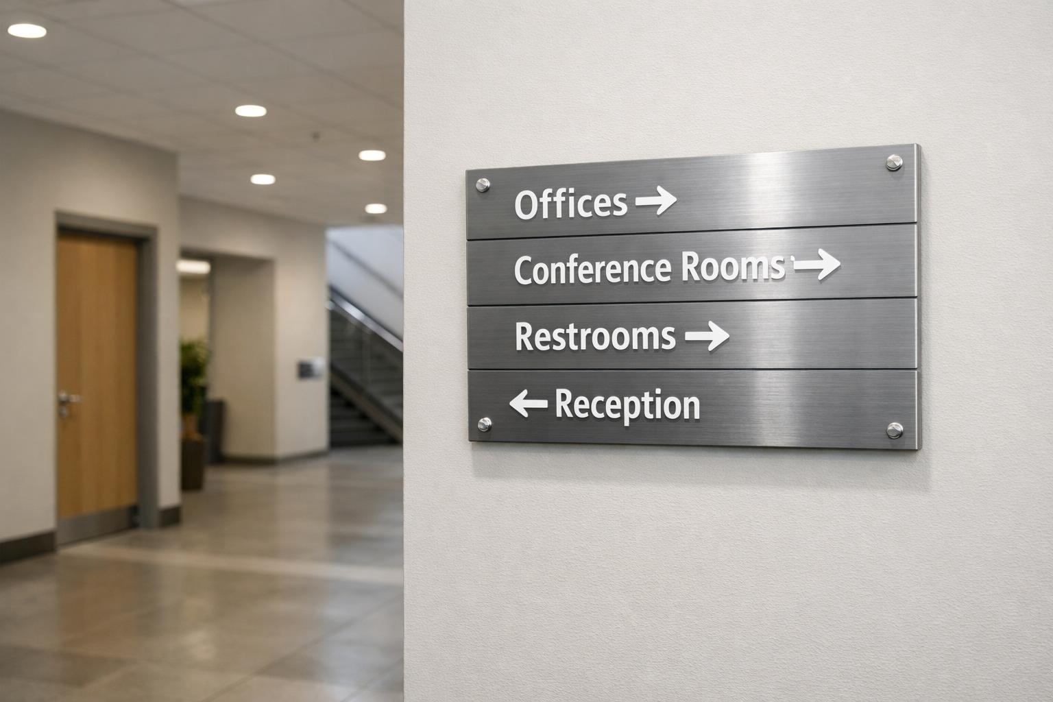
Walk past any Melbourne shopping strip and you’ll notice it instantly. Some storefronts grab your attention. Others get completely ignored. The difference isn’t always budget. Most of the time, it comes down to three things: colour, typography, and symbols.
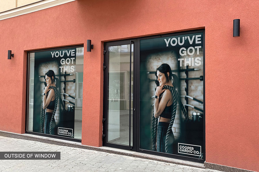
Your storefront window graphics, vinyl graphics, and window decals for business only work when these three elements are done right. Nail all three and people stop, look, and walk in. Miss even one and you become invisible. This applies to every retail wayfinding graphic idea you’ve had, every signage idea on your list, and every business graphic you’re planning.
Let me tell you the truth about colour contrast, the simple math behind readable text, and why using your branding colours is not good advice.
Table of Contents
ToggleEssential Takeaways
- Colour contrast is what makes your retail window graphics readable in reality; the minimum should be a 7:1 luminance contrast ratio.
- The safest option for any signage ideas for storefront window graphics or any other signs are sans-serif fonts such as DIN, Frutiger or Helvetica Neue.
- Signage symbols and icons are vital in multilingual areas. Icon-first approach is the key for making your signs work for everyone no matter the language.
- All your signs starting from window decal signs up to internal signage are to be consistent. Only this way they will form a guiding system.
Is Your Signage Guiding People Or Getting Ignored?
Wayfinding design is the system of signs, colours, and symbols that helps people move through a space without confusion. It’s not decoration. It’s communication and it needs to work the moment someone looks at it.
Most Melbourne businesses treat their business graphics as an afterthought. That’s the core problem. Research shows that 79% of consumers judge a business’s quality based on its signage alone. Good signage doesn’t just look nice. It brings people through the door.
Does Colour Really Make That Much Difference?
Yes, more than most people realise. Colour is the first thing the brain picks up. Before anyone reads a word on your signage, they’ve already felt something based on your colours. That feeling drives whether they stop or keep walking.
Contrast Matters More Than Colour Choice
I’ve seen expensive storefront graphics completely fail because the colours looked great on a computer screen but vanished in Melbourne’s afternoon sun. The issue wasn’t the design. It was the contrast.
The higher the contrast between your text and background, the easier your sign is to read from a distance. Aim for a 7:1 contrast ratio as your minimum standard. That level of contrast works in bright sunlight, at night, and for people with low vision. A 4.5:1 ratio is the bare minimum, but 7:1 is where signs actually get read.
Use Colour to Show People Where to Go
Colours help people understand where they are and where to go next. Assign a specific colour to each zone in your space and keep it the same on your window signage, internal signs, and floor graphics. Once a customer connects a colour to a location, it has to stay that way. Changing it breaks their confidence immediately.
Colour also sets the mood. Blues and greens feel calm and trustworthy. Oranges and yellows feel active and energetic. According to CCR Magazine, warm colours like red create urgency while cool colours build trust and that directly affects how customers behave in your space.
Brand Colours Can Work Against You
Here’s something most signage briefs get completely wrong. Your brand guide says cobalt blue. Fine. But if your shopfront has a glass exterior that reflects the sky, cobalt blue disappears into it.
A University of Loyola Maryland study found that colour increases brand recognition by up to 80% but only when that colour is actually visible. Always test your colours on the real surface in natural light before committing. Don’t trust the screen. Trust the wall.
Does Font Choice Actually Matter for Window Signage?
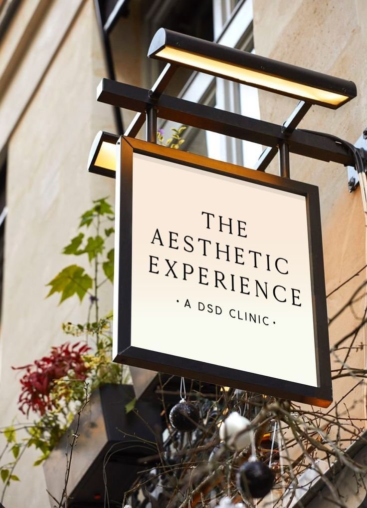
Absolutely, and most businesses get this wrong too. The font on your vinyl window graphics and business graphics is a legibility decision before it’s a style decision. If people can’t read it quickly from the footpath, the design has already failed.
Keep It Simple and Readable
Use clean, sans-serif fonts. A simple rule: one inch of letter height for every ten feet of viewing distance. Fonts that work well for window signage include Helvetica Neue, Frutiger, DIN, and Gotham. They stay sharp and clear at a distance and don’t fall apart under harsh light.
I’ve seen businesses use beautiful script fonts on their vinyl window graphics. In photos, they look stunning. At five metres in direct sunlight? Completely unreadable. No one stopped.
Simple Rules That Make a Real Difference
- Use mixed-case text, as it’s read faster than all-caps
- Add a little extra letter spacing on text meant to be read from a distance
- Only use bold for the most important words
- Avoid decorative, condensed, or italic styles on any directional sign
- One message per sign; the more you try to say, the less people take in
Why Symbols Are the Most Underrated Part of Signage
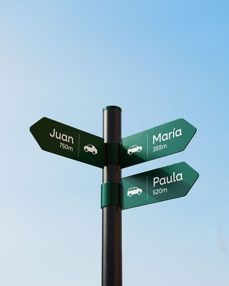
Symbols work faster than text. A well-placed icon communicates in under a second before the brain has even started reading words. In a city as culturally diverse as Melbourne, that speed matters enormously.
A well-defined arrow and a clear icon would convey the message immediately to anyone from any linguistic background. However, it is advisable to always combine an icon with one or two words. Some icons may be too ambiguous to convey the intended meaning alone.
Three Quick Checks Before Using Any Symbol
- Can someone recognise it in under 1.5 seconds from three metres away? If not, make it simpler.
- Does it work for non-English speakers and older visitors?
- Does it pass a 7:1 contrast test against the background it sits on?
In areas like Footscray, Richmond, and Docklands, where Melbourne’s diverse communities shop every day, icon-first signage design isn’t just thoughtful. It’s a smart commercial decision.
Colour vs. Typography vs. Symbols: A Simple Comparison
Here’s a quick side-by-side breakdown of how each element works, where most businesses go wrong, and what to do instead.
| Element | What It Does | Common Mistake | What to Do Instead |
| Colour | Sets zones and mood | Choosing colours without testing contrast | Test on the real surface; target 7:1 ratio |
| Typography | Makes text readable | Using decorative fonts that blur at distance | Stick to sans-serif; use mixed case |
| Symbols | Instant, wordless navigation | Using unclear or generic icons | Use universal icons; pair with short text |
People Also Ask
1: What makes good wayfinding design?
Clear contrast, simple fonts, and easy-to-recognise symbols used the same way across every sign are what make good wayfinding signage. Consistency is everything.
2: What fonts work best for business window signage?
Sans-serif fonts: Helvetica Neue, Frutiger, DIN, Gotham. Clean, readable at distance, and proven in real-world conditions.
3: How does colour affect wayfinding?
It identifies zones and triggers emotional responses before anyone reads a word. A 7:1 contrast ratio keeps it readable for everyone, in any light.
4: Why do symbols matter in storefront signage?
They communicate instantly and work across language barriers which are critical in Melbourne’s multicultural retail environment.
5: What’s the difference between window decals and vinyl window graphics for business?
Window decals use static cling and are easy to remove. They are great for short-term use. Vinyl window graphics bond directly to glass and suit long-term brand display or permanent directional signage.
Final Verdict
Before briefing anyone on new window signage ideas or retail window graphics ideas, check the contrast on what you already have. Take your logo, your main colour, and your window background and run them through a free 7:1 contrast checker online. It takes five minutes. And it’ll tell you straight away whether your current signage is working or silently failing you.
That one check is the best place to start.
Ready to build signage that actually performs? Explore our signage solutions built specifically for Melbourne businesses that need results, not just a good-looking window.