Have you ever walked into a massive hospital only to spend twenty minutes walking down identical hallways? Or perhaps you have entered a large shopping centre looking for a specific shop. But the map is confusing, old, or missing entirely.
We have all been there. The frustration builds up fast. Your heart rate goes up, your patience runs out, and your opinion of the building drops immediately.
If you manage a building, an office, or a retail shop, this is a major problem. When visitors feel lost, they feel unsafe. In the retail world, a confused customer does not buy things. They just leave. In healthcare, lost time is a serious issue.
This blog will explore how modern wayfinding displays solve these problems. We will look at how they turn confusing spaces into friendly places that people actually enjoy visiting.
Table of Contents
ToggleKey Points
- Good wayfinding keeps visitors from feeling anxious and makes your business feel welcoming.
- The best outcomes are derived from using digital screens for changing information and static graphics for permanent areas.
- Your signs must be designed for all people, including those with disabilities, if they are truly to work.
- Professional signage tells your customers that you are organised and that you care about their experience.
What are Wayfinding Displays and How Do They Work?
Let’s start with the basics. Wayfinding is just a process of figuring out where you are and how to get to where you want to go. So, what are wayfinding displays and how do they work?
These are the visual clues that help people understand a physical space. They act as a bridge between a complex building design and the person walking through it. They work by doing three simple things:
Identification: Telling you, “You are here.”
Direction: Telling you, “Go this way.”
Information: Giving you details, like “Opening Hours” or “Lift Out of Order.”
According to healthcare design studies, nearly 30% of first-time visitors to hospitals get lost. This causes stress for patients and wastes staff time giving directions. If your space is hard to navigate, you are losing efficiency.
Safety and Efficiency Through Wayfinding Signage
This isn’t just about convenience; it is about safety. In an emergency, people can panic. If your exits aren’t clear or your escape routes are confusing, it becomes dangerous.
Safety and efficiency through wayfinding signage happen when the information is instant. Users shouldn’t have to stop and think to understand a sign. It needs to be obvious.
By making movement smooth, you also stop crowds from bunching up in lobbies or reception areas. This lets your staff focus on their actual jobs instead of acting like human GPS systems.
Looking at Your Options
Once you know you have a problem, you need to look at solutions. To improve customer experience, you need to choose the right type of signs for your space.
Digital Wayfinding Signage vs Static Signs
This is a common question in the industry.
- Digital Signage: These are screens or interactive kiosks. They can change instantly. This is great for changing room schedules or displaying different languages.
- Static Signage: These are wall signs, vinyl stickers, and arrows. They don’t need power, they rarely break, and they are cheaper.
So, regarding Digital wayfinding signage vs static signs – which is better? The answer is usually a mix of both. You need digital signs for changing info and static signs for permanent things like toilets or exits.
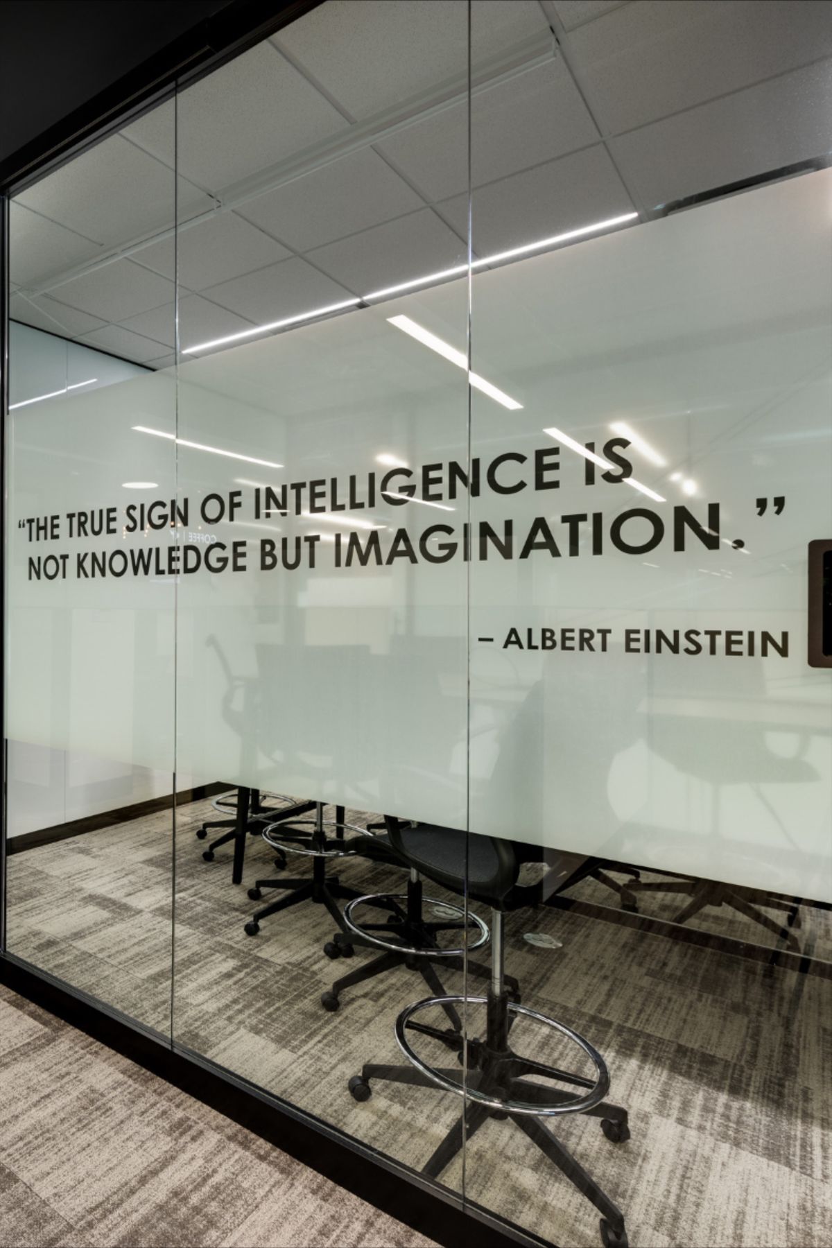
For example, many modern offices use custom window graphics to apply static wayfinding right onto glass meeting rooms. It looks sleek, saves floor space, and guides people naturally.
Examples of good wayfinding display can be seen in big airports like Sydney Kingsford Smith. They use clear icons, bright colours, and huge text. They assume the user is rushing and tired, so they make the signs impossible to miss.
Help With Accessibility for Disabled Users
In Australia, accessibility is not optional. It is a must. Your signs must help with accessibility for disabled users. This means more than just a wheelchair ramp sign.
- Visual Issues: Do you have high-contrast colours? Is there Braille on your room signs?
- Mobility Issues: Do your signs clearly show lifts and accessible paths versus stairs?
- Cognitive Issues: Are you using simple icons rather than long, complex sentences?
According to the World Health Organisation, over 1 billion people live with some form of disability. If your signs ignore them, you are leaving out a huge group of people.
Design Tips for Modern Offices/Hospitals
When planning your signs, don’t just stick a poster on a wall. Think about the whole room.
- Colour Coding: Use different colours for different areas (e.g., Blue for Cardiology, Green for Kids).
- Sight Lines: Place signs where people make decisions, like hallway intersections.
- Fonts: Use simple fonts that are easy to read from far away.
Using these design tips for modern offices/hospitals ensures the signs look good and actually help people finding their way.
Making the Right Investment
You know the problem, and you know the options. Now, how do you get started?
Latest Trends and Real-World Applications
The latest trends are moving toward mixing signs with mobile phones (QR codes that load maps) and using the building itself as a guide.
For businesses in Australia, using glass surfaces is very popular right now. In fact, Window Graphics Melbourne trends show a big shift toward frosted films. These films offer privacy for offices while also displaying room numbers or arrows. It serves two purposes at once and looks very professional.
Best Wayfinding Solutions
- Hospitals: Coloured lines on the floor work very well here. Stressed people tend to look down while walking.
- Shopping Centres: Digital screens are the best choice here. They let shoppers search for a specific brand.
- Offices: Window graphics on glass walls are the winner. They keep the office feeling open but clearly mark where rooms are.
In retail shops, confusion kills sales. If a customer can’t find the change room or the checkout, they might just walk out. Benefits for retail foot‑traffic include customers staying longer and buying more. Good signs make your brand look trustworthy.
The Cost of Installation
The most important question: How much does it cost to install?
- Static/Vinyl: This can be a few hundred to a few thousand dollars, depending on the size of your space.
- Digital: This can range from $2,000 to over $20,000 per screen, depending on the technology.
However, you must look at the return on investment. If your staff are interrupted less and your customers are happier, the signs pay for themselves quickly.
Frequently Asked Questions
1. Can digital wayfinding screens work if the internet goes down?
Yes, most modern digital screens download the maps and info directly to the device. This means that even if your Wi-Fi stops working, the directory will still work perfectly for your visitors.
2. How often should I update my physical signs?
Anytime you are renovating your building, switching the departments around, then the signs need updating immediately, so people are not sent elsewhere.
3. Are there eco-friendly options for signs?
Absolutely, many of the makers now offer PVC-free vinyl and recyclable materials for rigid signs. Using green materials is one great way to help your business meet its sustainability goals.
4. At what height is it best to put up wall signs?
For general viewing, signs should be about 120cm to 150cm off the floor. This is the “visual sweet spot” for most adults and usually meets accessibility standards for wheelchair users.
5. Do I need a council permit for window graphics?
This depends on your local council rules. Internal graphics usually don’t need a permit, but signs on external windows that face the street often do. Always check your local bylaws first.
Conclusion
Getting around a modern building should not have to feel like trying to work out some sort of puzzle. Whether a person runs a hospital, office, or retail shop, the way one guides people speaks volumes about a business.
By investing in clear, easy-to-read wayfinding displays, you aren’t just hanging up pictures; you’re improving user experience. This keeps people safe and helps your business grow. Don’t let your visitors get lost.
Ready to upgrade your space? Get expert advice and premium signage solutions through Window n’ Wall Graphics today.


