Walking through a retail building, hospital, or any large structure shouldn’t be akin to solving a maze puzzle, correct? And yet, countless customers sense exactly that when confronted with ineffective wayfinding signage.
Come on, folks: having wonderful products or services is only half the fight. If individuals can’t navigate your space with ease, it can result in frustration, lost time, and ultimately, lost sales or prospects. You’d be amazed at how prevalent wayfinding errors are!
But fear not – this is an issue that can be rectified if you’re aware of the typical pitfalls. In this post, we’ll explore 5 large wayfinding errors, how they occur, and more importantly, how to prevent them. And as a bonus, we’ll add some wayfinding design best practices so your customers will never get lost again.
Table of Contents
ToggleKey Points
- Keep it simple – strive for fewer words and greater clarity on your wayfinding signs in Melbourne.
- Prioritise positioning – always think about foot traffic flow and visibility.
- Accessibility is a must – design for all, not just the masses.
- Always test and improve – customer feedback is priceless.
Why Does Wayfinding Matter
Before we dive straight into the blunders, let’s discuss why wayfinding is so crucial. Data from Dimensional Research indicates that 50% of shoppers are less likely to visit a store again after a negative experience there – and yes, losing one’s way within a disorienting space is a negative experience!
Actually, Wayfinding design giant SEGD even points out that customers make assumptions about space (and its overall brand, if it’s a business or store) within minutes of being within the space. If they’re walking around lost trying to figure out where to go, that assumption won’t be good at all.
Okay, that’s the doom-and-gloom. Now let’s discuss the solutions to these issues by first determining the most frequent wayfinding errors we see on a regular basis.
1. Overloading Your Signs with Text or Design
Let’s be honest, we all feel bogged down when there’s too much information presented in one area. And when it comes to wayfinding signage, this is one of the biggest errors businesses commit.
Why This Happens:
- Companies desire to put on the sign every last bit of information.
- It is assumed that “more info = better guidance.”
Real Consequences:
- Shoppers don’t really read cluttered signs.
- They get confused or avoid the sign altogether.
Even psychologist Dr. Sheena Iyengar confirms that too much information causes “choice paralysis.” The same applies to general signage: we can’t process cluttered graphics or text correctly.
How to Fix It:
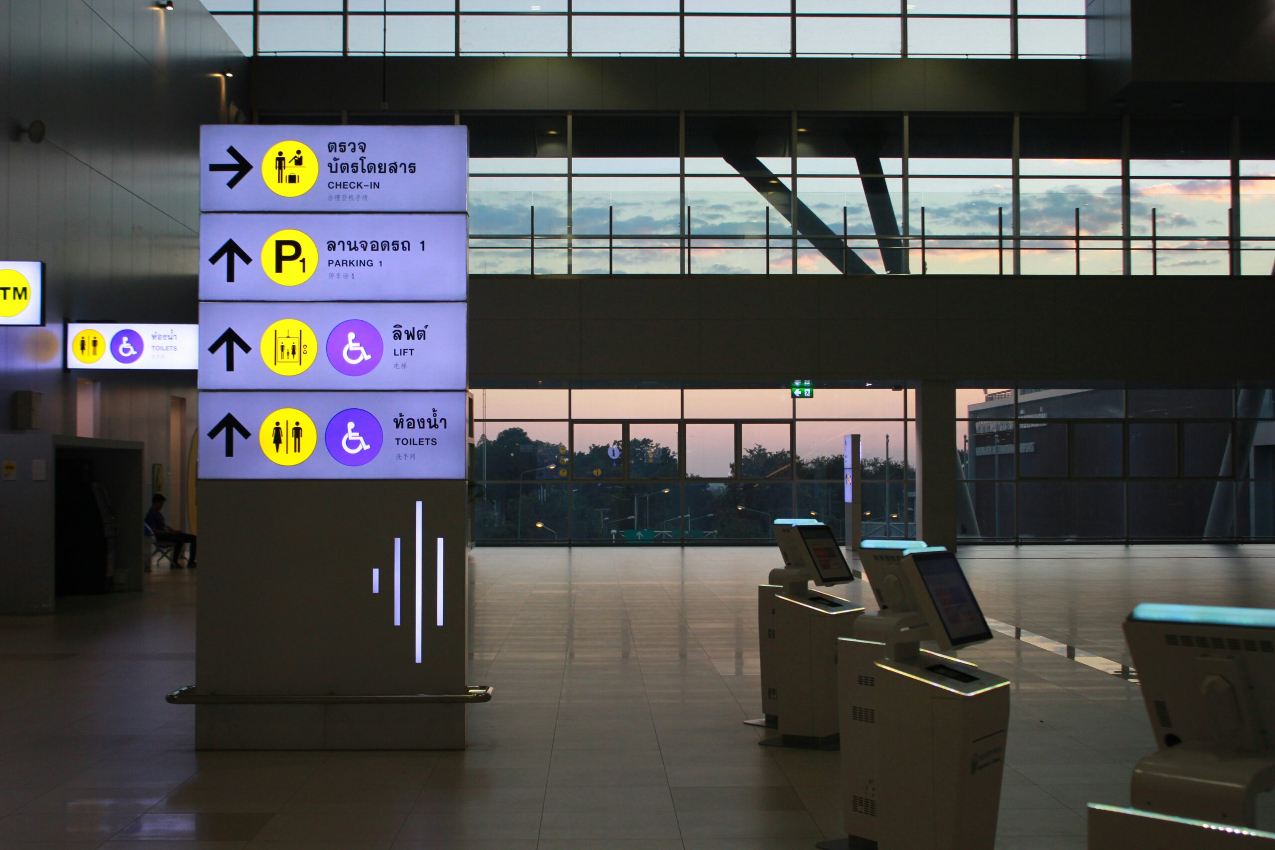
- Keep the message simple. A good guideline is: less than 7 words per directional sign.
- Use a clear hierarchy! An example: bold, stand-out arrows at the top do wonders for wayfinding signage solutions.
- Always utilise clean, uncluttered fonts and high-contrast colours (such as black and white or yellow and black).
Pro Tip: If you’re adding digital wayfinding signage, make it interactive but simple. No one wants to wait there reading an essay on a touch screen!
2. Putting Signs Where Customers Least Expect Them
Picture this: you’re browsing a store for the checkout counter, and you see not a sign until it’s too late. That’s really frustrating, isn’t it?
Why This Happens:
- Signs may be placed for looks rather than usability.
- Companies don’t measure signage visibility from the actual customer perspective.
Actual Consequences:
- Customers become confused and may even exit a busy store without a purchase.
- Companies lose the ability to enhance effortless navigation.
How to Fix It:
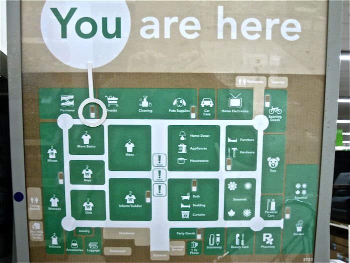
- Know people flow in your building. Where do individuals naturally stop or glance around? That’s where your signs need to be.
- Post signs at eye level where possible. If the sign is for wayfinding design best practices, posting it above and centrally located in a large area will prevent nasty situations!
3. Inconsistent or Ambiguous Language
Here’s the catch: if one sign directs you to move “Southwest” and another sign directs you to “Exit 2” without directions, aren’t you going to be confused?
Why This Happens:
- The terminology or naming conventions may perhaps not have been uniform throughout all wayfinding display signs.
- Insufficient department coordination while creating the signage system.
Real Consequences:
- Ambiguous or conflicting wording causes confusion among customers in stores – nobody wants that frazzled ‘where-do-I-go-now’ feeling.
- It can undermine the overall experience and even your reputation.
How to Fix It
- Use clear, consistent directional language. For example, use “Entrance” and “Exit” on all your wayfinding signage in Melbourne instead of varying terms.
- Test your labels (ex: north/west or floor levels) so they’re intuitive for the average person.
4. Not Testing Your Signs Before Rolling Them Out
Honestly, how often do businesses forget to ask real customers to interact with trial signage? More often than you’d think!
Why This Happens:
- Not putting customer experience first in planning.
- Desiring to implement solutions rapidly without adequate testing.
Actual Consequences:
- Bad wayfinding consequences are confusing signals, poor placement, and customers STILL lost – even with your signs!
- Signs might need to be revised again, which is expensive.
How to Fix It:
- Survey your employees and real customers for feedback in a soft trial phase.
- Look at how individuals engage with the signs and note any hesitation.
- By doing this, you’ll prevent wayfinding signage design mistakes in the future.
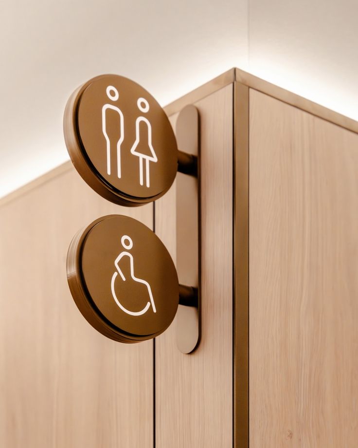
5. Disregarding Accessibility Standards
Wayfinding signage systems need to accommodate all – including customers with impairments or disabilities. Disregarding this is not only a blunder but also non-compliant with accessibility standards.
Why This Occurs:
- Accessibility is not incorporated into wayfinding design plans from the start.
- Compliance requirements misunderstandings.
Actual Consequences
- Visually impaired or mobility-impaired customers find it difficult to move around in the area.
- Companies risk losing credibility or even facing legal consequences.
How to Correct It:
- Ensure your signs are ADA-friendly and accessible to everybody.
- For physical signs: large print, clear font, high contrast in colours, and tactile characteristics are a requirement.
- For digital screens, implement voice instructions and text-to-speech functionality to enhance accessibility.
Frequently Asked Questions (FAQs)
1. Why is wayfinding significant in retail?
Wayfinding makes the customer journey seamless and avoids confusion so customers can quickly locate the things they want or need. It’s essential to make customers happy and bring them back again and again.
2. What are some examples of poor wayfinding?
Inadequate sign placement, insensitive language, confusing imagery, and insensitive accessibility elements are typical examples of wayfinding errors.
3. How to simplify wayfinding for customers?
Use simple and consistent language, position signs at eye level, have minimal design, and consistently pilot test signs prior to final use to promote ease for customers.
4. How does poor wayfinding hinder customer experience?
Poor wayfinding annoys customers, keeps them waiting, and can even cause them to abandon your store in total, impacting sales and loyalty.
5. What leads to customer disorientation in physical spaces?
Overloaded text, inappropriate placement of signs, conflicting information, and inaccessible wayfinding all lead to confusion.
Ready to make your customers’ journey a better one? Window n’ Wall Graphics offers premium wayfinding signage in Melbourne that guarantees your customers will never lose their way again.
Get in touch with us today to see how we can assist!
